Retro Home Color Palettes That Are Making A Comeback
We may earn a commission for purchases made using our links. Please see our disclosure to learn more.
A beautiful room can still feel flat when it lacks color. Retro home color palettes bring back the playful pinks, warm browns, earthy greens, and rich blues that gave older homes so much personality.
That doesn’t mean turning your living room into a 1970s movie set. The trick is to borrow the combinations you love, soften them where needed, and leave room for modern furniture and everyday life.
Six Retro Home Color Palettes Worth Trying
1. Avocado Green, Mustard Yellow, and Walnut
This combination captures the earthy side of the 1970s. Avocado green works beautifully on a cabinet or accent chair, while mustard yellow brings warmth through cushions or artwork.
Walnut furniture gives both colors a natural anchor. Add cream walls or oatmeal curtains to keep the room from feeling too dark. It suits living rooms with wooden floors.
2. Burnt Orange, Chocolate Brown, and Cream
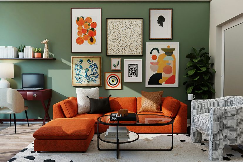
Want warmth without endless beige? Try burnt orange against chocolate brown, then lighten the mix with cream.
An orange throw, brown leather chair, and off-white rug can make a simple room feel layered. For a bigger change, paint a reading nook in muted rust. Avoid pairing every surface with dark brown; a little breathing room makes the orange stand out.
3. Mint Green, Pastel Pink, and Soft White
1950s-inspired pastels can be surprisingly easy to live with. Mint and blush pink feel light and cheerful, particularly in kitchens, bathrooms, and bedrooms.
Try mint cabinets with warm white walls and small pink accessories. For a subtler look, choose dusty rose over bubblegum pink. Brushed chrome or pale wood adds a clean, contemporary finish.
4. Teal Blue, Warm Orange, and Ivory
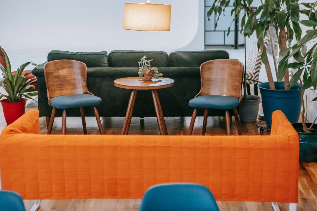
This pairing borrows mid-century contrast. Teal provides depth; orange gives the room energy.
Start with a teal sofa or painted sideboard. Then introduce orange through a ceramic lamp, print, or patterned cushion. Ivory curtains and simple furniture keep the combination polished rather than loud.
5. Terracotta, Olive Green, and Sand
Terracotta and olive are a gentler way to explore retro color. Their earthy undertones pair naturally with linen, rattan, stone, and unfinished wood.
Try a terracotta feature wall, olive cushions, and a sand-colored sofa. The result feels warm, not overly themed, especially with neutral furniture.
6. Mauve, Dusty Blue, and Warm Gray
If you love softer 1980s color schemes, look beyond neon. Mauve and dusty blue offer a quieter vintage reference that suits bedrooms and home offices.
Use muted blue walls and add mauve bedding or a small chair. Choose a warm, slightly beige gray instead of a cold silver gray to make the room feel comfortable.
How to Make Retro Colors Feel Modern
Give One Color the Leading Role
Choose one dominant color, one supporting shade, and one smaller accent. A rough 60/30/10 split offers a starting point, not a rule.
For example, keep most walls cream, use olive in furniture or curtains, and finish with a few burnt-orange details. Repeating one accent two or three times makes the room look planned.
Mix Vintage Tones With Simple Furniture
Retro colors work best when not every piece demands attention. Pair a bold patterned rug with a plain sofa. Balance a curvy vintage lamp with a clean-lined side table.
Cane, oak, walnut, and linen add texture without competing colors.
If you want to test a stronger shade before committing, try a small painted accent wall. These bedroom accent wall ideas offer practical ways to use paint, wallpaper, and texture without changing an entire room.
Test Color in Your Actual Lighting
A mustard paint sample can look golden in morning sunlight and muddy under a cool ceiling bulb. Large samples are worth the effort, especially for olive, brown, and terracotta.
Check the color in daylight and after dark. Compare it with flooring and furniture; undertones can change the result.
Which Retro Palette Works Best in Each Room?
Living room: Olive, rust, and cream create a welcoming backdrop for family time. Use the strongest colors in textiles if you don’t want to repaint.
Kitchen: Mint, butter yellow, and white give cabinets or backsplashes a vintage lift. Keep hardware and counters simple.
Bedroom: Dusty blue, mauve, or soft sage work well when you want gentle color instead of dramatic contrast.
Home office: Teal with walnut and a small orange accent can make a workspace look distinctive without surrounding your desk with busy patterns.
Top Products for a Retro Color Refresh
These five accessories let you experiment before investing in paint or furniture.
1. NuWallpaper Peachy Keen Pink Peel-and-Stick Wallpaper
This vintage-inspired floral wallpaper brings pink, peach, and green into an entryway or bedroom. Use it on one smooth accent wall or inside an alcove. Check surface requirements before installation.
2. Loloi II Layla Ocean/Rust Area Rug
This rug blends faded blue and rust in a vintage-style pattern, connecting a teal chair, cream sofa, and wood table. Measure before choosing a size.
3. Sullivans Multicolored Ceramic Vase Set
This small set features aqua, orange, and green vases. Arrange them together on a shelf or separate them across the room to repeat your palette. They suit 1960s- or 1970s-inspired accents.
4. MIULEE Mustard Yellow Boho Pillow Covers
Mustard pillow covers add a warm retro note to an olive, cream, or brown sofa. The woven design introduces texture without requiring another piece of furniture. Confirm the insert size; these are covers rather than complete pillows.
5. Lush Decor Boho Macrame Textured Cotton Curtain
This navy cotton macrame panel adds the handcrafted texture associated with 1970s interiors. Try it as a decorative window accent or room divider. Its open weave is not a substitute for privacy or blackout curtains.
Why Retro Colors Still Feel Right at Home
Retro colors do more than remind us of past decades. Warm browns, earthy greens, and soft yellows can make a room feel cozy and welcoming. Research published in the Annual Review of Psychology suggests that colors can influence emotions and behavior, although their effects depend on the setting and personal experiences.
These familiar shades also have a rich design history. According to Sherwin-Williams’ look at 1970s color trends, avocado green, harvest gold, burnt orange, and earthy browns helped define the decade’s interiors. Today, these same colors work beautifully with modern furniture, natural textures, and softer neutrals. You can bring back their vintage charm without making your home look outdated.
Conclusion
Retro home color palettes are back because they offer something many neutral rooms lack: warmth, contrast, and personality. Start with the decade that appeals to you, pick two or three colors, and introduce them gradually. When vintage shades share space with modern pieces, your home can feel nostalgic without looking stuck in the past.
FAQs
What are the most popular retro home color palettes?
Avocado green, mustard yellow, burnt orange, chocolate brown, mint, pink, and teal are closely associated with mid-century and 1970s interiors. Mauve and dusty blue also recall softer 1980s schemes.
Can retro colors work in a small room?
Yes. Use a light base, such as warm white or cream, and add one deeper accent through a chair, rug, or painted section. You can enjoy retro character without making every surface visually busy.
How do I mix retro colors with modern furniture?
Keep furniture shapes relatively simple and repeat a limited palette. For example, combine a modern cream sofa with an olive chair and rust cushions. Let one patterned piece provide most of the visual interest.
Are retro color palettes expensive to recreate?
Not necessarily. Start with pillow covers, secondhand ceramics, framed prints, or a small paint project. These changes cost much less than replacing sofas, cabinets, or flooring.
Should I use bright or muted retro shades?
Both can work. Muted hues are often easier across large surfaces, while brighter colors suit small accents. Test samples beside your existing furniture before making a permanent choice.